by Jo Lawson-Tancred // Apr. 16, 2021
As scientists accumulate more and more data, these dense webs of interconnected information and the possible discoveries to be made about our world feel increasingly beyond our grasp. The problem of how to visualise such complex data networks has been the life work of Hungarian-American physicist Albert-László Barabási. At the fruitful intersection of art and science, his lab uses aesthetic properties like colour and size to emphasise certain aspects of the data and reveal to us otherwise hidden connections and patterns. Each beautiful network visualisation that results allows us to interpret the data’s meaning without getting lost in its complexity. Together, these networks tell a story about the world we live in.
The development of this visual language over 25 years, from 2D images in the 1990s to today’s state-of-the-art techniques using AR, VR and 3D sculpture, has been traced for the first time in the new exhibition and publication ‘Hidden Patterns: The Language of Network Thinking.’ Formerly at the Ludwig Museum in Budapest, it travels to the ZKM Karlsruhe from May 1, 2021 until January 9, 2022. We spoke to Barabási ahead of the exhibition at ZKM.
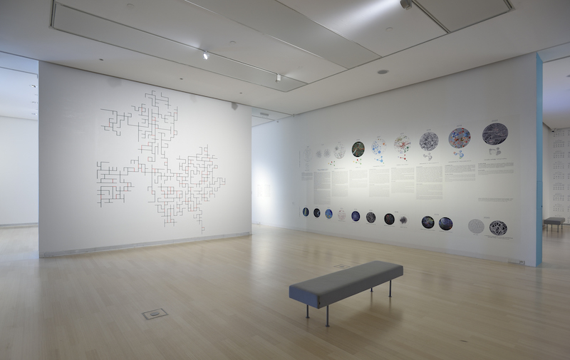
BaribasiLab: ‘Hidden Patterns’ at Ludwig Museum, October 2020 // Courtesy Rosta Jozsef
Jo Lawson-Tancred: To build your networks you have developed a visual language that uses aesthetic qualities such as the colour and size of the links and nodes. How do art and science intersect in network visualisation?
Albert-László Barabási: There’s a long history of conversation between the two fields of science and art, but it has typically been one way. The art community gets inspired by science and integrates that into their practice. We’ve had a different journey because I’m a scientist but, at the same time, I originally dreamed of becoming a sculptor and have taken art classes. When we started to work on networks, my interest in art got moved into network visualisation. At that time, we were starting to get real data about how complexities are organised and how things are connected from social networks to the internet and so on, but there wasn’t a visual language to depict that. If you look at the first image that we created in 1995, it was really deeply rooted in physics and depicted the network as a lattice with the nodes not explicitly shown. As the data became available and offered us new challenges, we had to step-by-step discover the best way to talk visually about these networks.
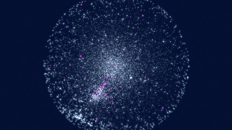
BarabásiLab: ‘The Human Disease Network,’ visualization, screened during 2012 TEDMED Talk // Courtesy of BarabásiLab
JLT: I know you were involved in identifying which existing drugs might help treat Covid-19. Could you explain how network data can be used to make important new discoveries, and how visualisation aids this?
ALB: My lab has had a long term interest in network medicine and understanding the network within the cell. Our first map ‘The Human Disease Network’ (2007) showed how diseases are connected to each other. A few years later, we moved beyond that and not only connected diseases by their genes but also determined the network between our cells and how that network breaks down and leads to disease.
Given this understanding, when Covid-19 really hit us in March 2020 and the data became available, we and multiple collaborators tried to find drugs that could be used to treat it. Covid-19 works by perturbing the sub-cellular network, the network of interactions between our proteins within our cells, so the challenge was to search this giant network to find the place not where a disease resides but where Covid-19 attacks. Potential drugs would target the same neighbourhood it attacks, and so could perturb its ability to really bind to our cells. When a computer searches for these drugs in the network it runs algorithms, but actually this search process is a very visual process that we had to translate into computer language. This means it has beautiful visual manifestations, and we show that in the exhibition.
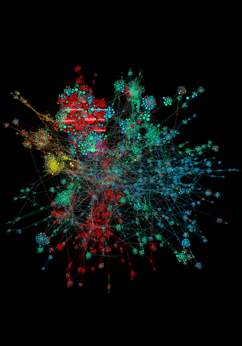
A.-L. Barabási, S.P. Fraiberger and A. Grishchenko: ‘The Art Network,’ created for “Quantifying Reputation and Success in Art,” Science, November 16, 2018 // Courtesy of BarabásiLab
JLT: Recently you made ‘The Art Network’ (2018), built using data collected by the economist Magnus Resch, which records the exhibition history of half a million international artists over the past three or four decades. What were the discoveries you made while visualising this network and were there any surprises?
ALB: The network connects institutions if they tend to exhibit the same artists. Having both exhibited an Andy Warhol would not be a sufficient connection because too many Andy Warhols are exhibited. Rather, by using statistical methods we could see whether two institutions tend to have the same perspective about art, through who they exhibit. We found patterns typical of all network architectures, such as some disproportionately large hubs and other communities of nodes that are locked together and isolated from the rest of the network. The value for the art world is in showing how isolated some parts of the art world are from the institutions that really matter, those that can canonise an artist. It also shows the difficulty of being an artist at the periphery. You can be on the periphery even if you exhibit throughout your life, but only at institutions that have no path towards the big, canonising institutions.
What is amazing to me is that art has really defied quantification for a long time and even I subscribe to the belief that it has some magic that cannot be quantified. However, data has arrived to the art world and numbers now allow us to predict the future career of artists. Our goal is to use data to understand the main patterns that characterise the art world and visualise this in a way that allows artists to understand where they are and where they need to be, in order to be traditionally successful. The network allows you to see both the big and local picture.
BaribasiLab: ‘Hidden Patterns’ at Ludwig Museum, October 2020 // Courtesy Rosta Jozsef
JLT: What would you say, in terms of the technology that your lab employs, have been the most exciting developments in network visualisation in recent years? And how do these technologies help people explore the networks?
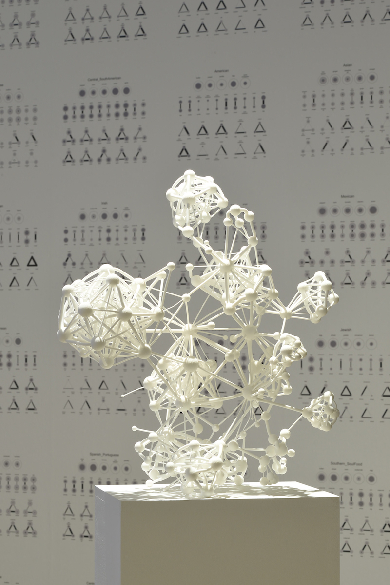
ALB: One of the most fascinating parts of this journey for me has been taking these networks out from abstract space—how they exist in computers—and into the physical space. For 20 years, we did this by visualising networks as images in two dimensions. About four years ago we finally managed to bring them into three dimensions, into what we call data sculptures. However, with really dense networks it is challenging to show all the nodes and links at once. The artist and designer Mauro Martino has come up with a visual perspective [as the network is navigated on a screen] which just shows the links that are closest to the viewer. This creates some sense of order in a big and messy network.
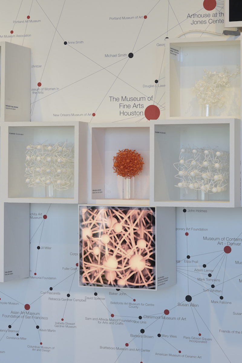
We’ve also started using VR to embed the individual into these complex networks, but the technologies we can exhibit are currently limited by health concerns. At ZKM, we want to place the viewer inside the Covid project; the search problem we faced and the evidence we used to see whether a drug worked or not. A large video installation will show all 6,000 drugs that were available to choose from and viewers can make touch-free gestures to choose a drug and learn if it was successful against Covid or not. When networks are dense, we can also laser engrave them into glass tubes, which offers exceptional fibre resolution. We will display laser engravings of some of the subnetworks that correspond to the drugs that were successful.
BaribasiLab: ‘Hidden Patterns’ at Ludwig Museum, October 2020 // Courtesy Rosta Jozsef
JLT: Why do you think now is a good time to have a retrospective of your work, and where do you see the future of network visualisation really headed?
ALB: Our work on network visualisation is over 25 years old now, but Covid-19 has brought an immense new awareness of networks in the past year, to the degree that I joke that everyone has become a bit of a network scientist. The community, whether they are artists or scientists or members of the public, are using language and having discourses that a year and a half ago you would only hear in my lab and a few other labs around the world. In that respect, I think this is the right moment to show, firstly, the visual beauty and complexity that really defines our social and biological existence and, secondly, the journey of how we arrived at the point where we can now get inside these systems and understand their behaviour.
Exhibition Info
ZKM | Zentrum für Kunst und Medien Karlsruhe
BarabásiLab: ‘Hidden Patterns’
Exhibition: May 1, 2021-Jan. 16, 2022
Digital Opening Reception: Thursday, Apr. 30; 6pm
zkm.de
Lorenzstraße 19, 76135 Karlsruhe, click here for map